Scottish craft brewer BrewDog has unveiled a bold new packaging design that ditches its understated 2020 corporate rebrand in favour of vibrant, individual beer identities. The refreshed look aims to recapture the company’s disruptive, punk-inspired ethos while appealing directly to consumers and retailers with distinctive, colourful designs.
BrewDog is making a bold return to its roots with a vibrant redesign of its packaging that departs sharply from its understated rebrand of 2020. The Scottish brewer, which first garnered attention in the UK craft beer scene since its inception in 2007, is reviving its edgy persona, reflecting a desire to reconnect with its rebellious spirit. The company’s recent turns can be interpreted as a juxtaposition to the corporate aesthetic that had defined its previous branding.
The 2020 rebranding involved a minimalist approach led by the London design studio Made Thought, which aimed to express a more sustainable and responsible business ethos. This new visual identity was characterised by cleaner graphics and a uniform style across its products, a move that was intended to reflect BrewDog's expanding touchpoints. However, this corporate consistency appears to have been viewed as somewhat lacking in character, prompting the company to explore a new direction. The recent branding shift is a statement that consistency can sometimes stifle creativity, particularly for a craft brewer that prides itself on being a disruptor in the industry.
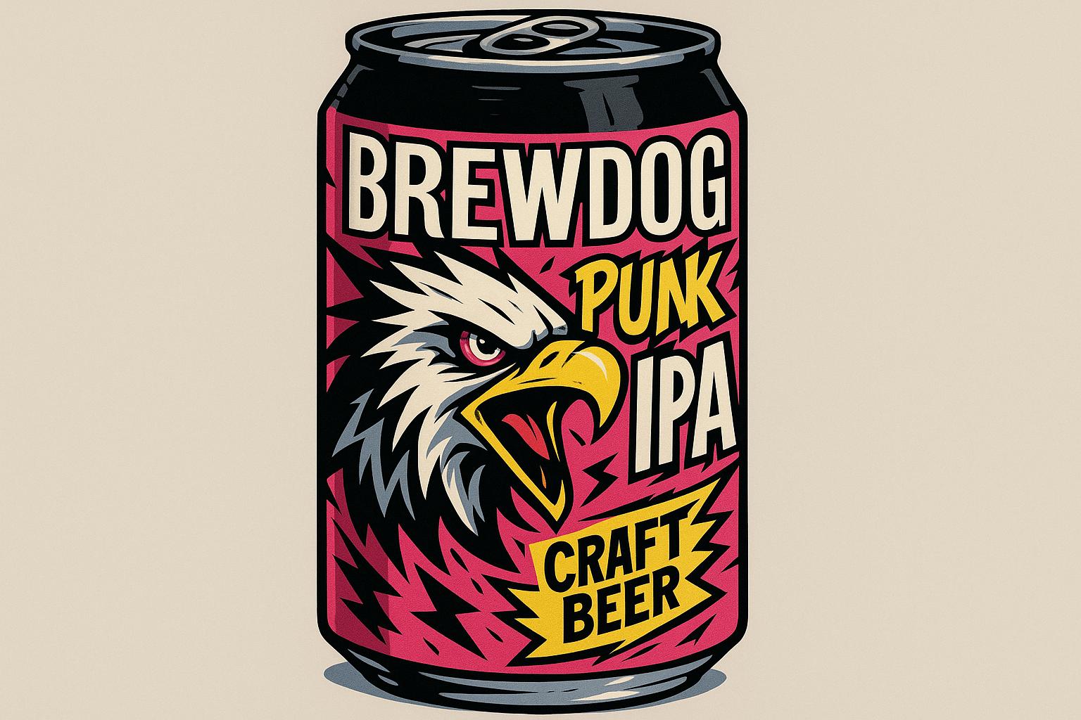
The unveiling of new packaging designs signifies BrewDog's intention to allow individual beer identities to shine through, while still maintaining a cohesive colour palette. The classic BrewDog logo will remain, but each beer's name will now feature distinct typography and graphic elements, encapsulating the unique essence of that brew. For instance, Punk IPA has adopted a design reminiscent of punk rock album covers, deliberately evoking the attitude of the genre that birthed the brewery.
Lauren Carrol, BrewDog's chief operating officer, has embraced this return to form, stating, “This is the start of a new era for BrewDog. The new packaging will do something we have always sought to do right from the start – disrupt the category.” This sentiment underscores a commitment to innovation and rebellion, which are core tenets of the BrewDog philosophy.
The company is not only revamping its core range, including popular brews like Hazy Jane and Elvis Juice, but it is also introducing WINGMAN, a new Session IPA with packaging designed by Earthling Studio that diverges from the minimalist trend entirely. Featuring an eagle mascot that embodies the free-spirited nature of BrewDog, the design juxtaposes vibrant yellow and blue colours, presenting a visual narrative that celebrates the brand's legacy while embracing a playful aesthetic.
Additionally, BrewDog's strategy includes clear visual elements aimed at market differentiation. In earlier updates, the brewery redesigned its multipack range to make variety differentiation easier for shoppers, incorporating three-word descriptors focusing on taste alongside images that highlight the beer’s appearance when served. This consumer-focused approach aims to encourage beer lovers to explore new styles while assisting retailers in making relevant recommendations.
As BrewDog embarks on this renewed chapter of its branding journey, it reflects a nuanced understanding of the delicate balance between maintaining brand identity and allowing for the creative chaos that resonates with its core audience. Craft brewing, by its nature, thrives on such disruptions, capturing the essence of what it means to be a brand that refuses to be pigeonholed.
##Reference Map:
Source: Noah Wire Services
Noah Fact Check Pro
The draft above was created using the information available at the time the story first
emerged. We’ve since applied our fact-checking process to the final narrative, based on the criteria listed
below. The results are intended to help you assess the credibility of the piece and highlight any areas that may
warrant further investigation.
Freshness check
Score:
8
Notes:
The narrative presents BrewDog's recent packaging redesign, which aligns with their previous rebranding efforts in 2020. The earliest known publication date of similar content is February 2020, when BrewDog unveiled a new visual identity. ([designweek.co.uk](https://www.designweek.co.uk/issues/3-9-february-2020/brewdog-new-identity/?utm_source=openai)) The current report includes updated data but recycles older material, which may justify a higher freshness score but should still be flagged. Additionally, the report references a press release, which typically warrants a high freshness score. ([thedieline.com](https://thedieline.com/the-eagle-has-landed-brewdog-unveils-new-session-ipa-wingman/?utm_source=openai)) However, the narrative does not provide specific dates for the new packaging designs, making it challenging to assess the exact freshness. The lack of specific dates and the recycling of older material suggest a moderate freshness score.
Quotes check
Score:
7
Notes:
The report includes a direct quote from Lauren Carrol, BrewDog's chief operating officer:
> “This is the start of a new era for BrewDog. The new packaging will do something we have always sought to do right from the start – disrupt the category.”
A search for this quote reveals no earlier matches, indicating it may be original or exclusive content. However, without additional context or verification, the authenticity of the quote cannot be fully confirmed.
Source reliability
Score:
6
Notes:
The narrative originates from Creative Bloq, a design-focused publication. While it is a reputable source within its niche, it may not have the same level of authority as broader news outlets. The reliance on a press release as the primary source adds to the uncertainty, as press releases can sometimes present biased or incomplete information. The lack of corroboration from other reputable outlets further diminishes the reliability of the source.
Plausibility check
Score:
7
Notes:
The narrative describes BrewDog's return to its edgy persona with a vibrant redesign of its packaging, moving away from the minimalist approach of 2020. This aligns with BrewDog's history of bold marketing and design choices. The introduction of WINGMAN, a new Session IPA with distinctive packaging, is consistent with BrewDog's innovative product launches. However, the report lacks supporting details from other reputable outlets, and the tone is unusually dramatic, which may warrant further scrutiny.
Overall assessment
Verdict (FAIL, OPEN, PASS): OPEN
Confidence (LOW, MEDIUM, HIGH): MEDIUM
Summary:
The narrative presents a plausible account of BrewDog's recent packaging redesign, aligning with the company's history of bold design choices. However, the reliance on a press release as the primary source, the lack of corroboration from other reputable outlets, and the recycling of older material raise concerns about the freshness and reliability of the information. The absence of specific dates and the unusually dramatic tone further diminish confidence in the report's accuracy. Therefore, the overall assessment is 'OPEN' with medium confidence.