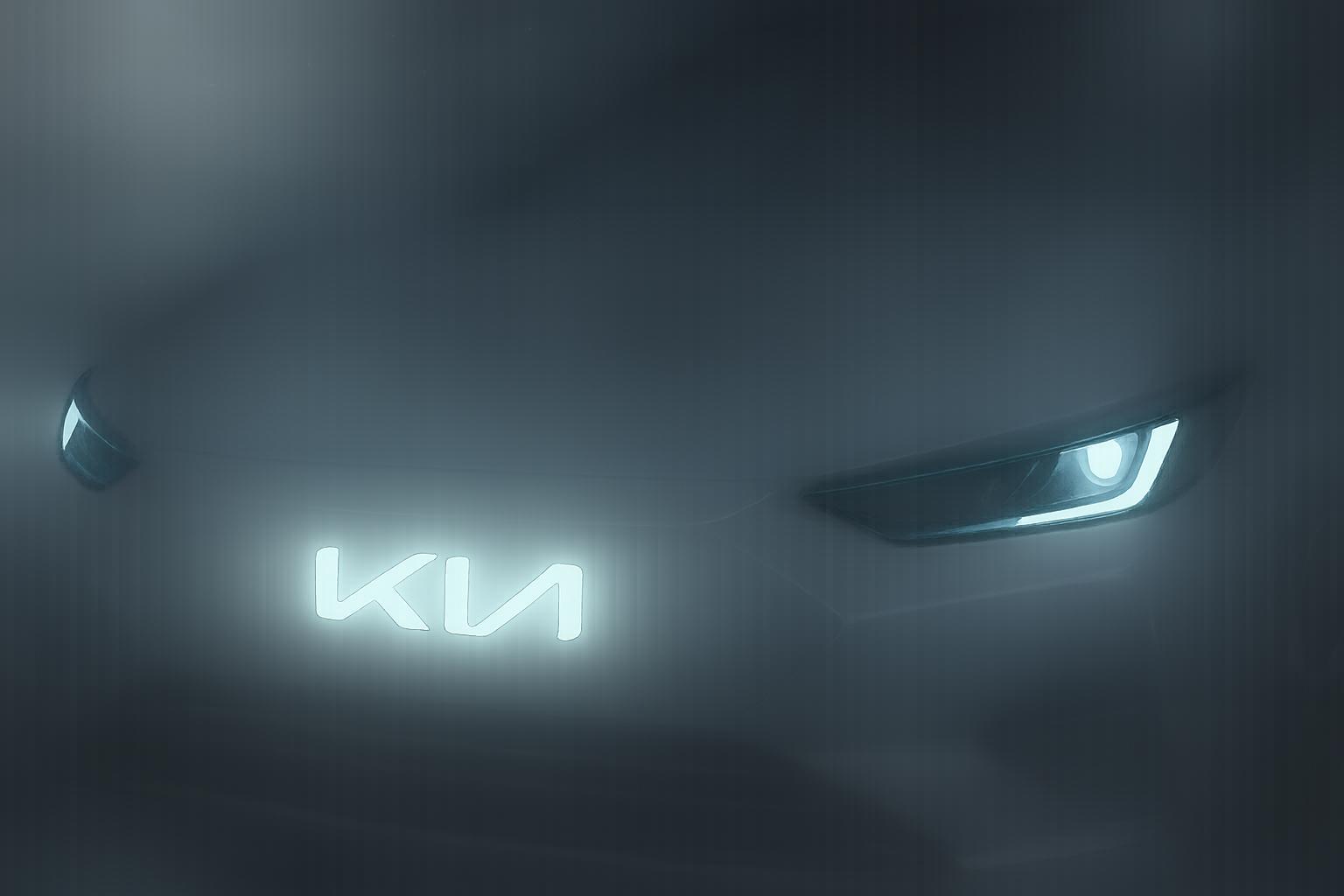
In the ever-evolving landscape of automobile branding, few recent redesigns have sparked as much debate as Kia's notable transition in 2021. Departing from its iconic red oval emblem, which had become synonymous with the brand over the years, Kia introduced a minimalist logo that simply spells out 'Kia' in a sleek, geometric font. However, the reception of this rebranding has been far from smooth, with a significant portion of the public misreading the logo to read as 'KN'. This ongoing confusion has emerged as a peculiar topic of discussion on social media platforms, particularly Reddit, as users express bewilderment over what they perceive as a new car brand entirely.
Kia's rebrand was not just an aesthetic makeover; it famously broke a Guinness World Record by using a staggering number of drones in its unveiling ceremony. However, the results left many observers questioning the design's legibility. A staggering number of individuals—approximately 30,000 each month—have since turned to Google to search for the 'KN car', underscoring the design's failure to resonate. According to branding experts, this coincides with violations of fundamental design principles, such as clarity and consistency, which are crucial for maintaining brand recognition and consumer trust.
The nature of Kia's rebranding seems to have missed its mark in several ways. While a fresh logo can breathe new life into a company, the 'Kia' design seems almost too minimalistic, sacrificing essential components that aid recognition for a contemporary look. For instance, the removal of the middle line in the letter ‘a’ may have been intended to convey modernity, but it arguably detracted from immediate recognition. In light of the adventurous spirit of its marketing campaigns—summed up in the slogan 'movement that inspires'—the logo’s current incarnation raises questions about its effectiveness in conveying stability and reliability.
Market trends also play a crucial role in understanding Kia's motivations. As consumers continue to gravitate towards hybrid and SUV models, the need for a logo that reflects this shift towards futuristic designs becomes paramount. Yet, the challenge for Kia lies in avoiding similarity to competitors in an increasingly homogenised market. Historical context reveals that Kia's logo evolution has seen dramatic shifts over the decades; however, the 2021 redesign stands as a notable point on the timeline, arguably not for its radical change but as a reflection of the need for relevance in a rapidly progressing automotive space.
Surveys and studies lend further credence to the notion that the rebranding efforts have not entirely succeeded. Data indicates that 44% of survey respondents struggled to recognise the new logo. This confusion has further been accentuated by continued searches for the term 'KN car', highlighting how branding efforts, while well-intentioned, have not translated effectively in practice.
In weighing these considerations, Kia faces a pivotal decision time. Options include adjusting the logo for improved clarity, rebranding under a new name altogether, or perhaps embracing the current design as a conversation piece while hoping that familiarity breeds recognition over time. The debate surrounding this rebrand serves as a reminder that while innovation is vital for staying relevant, it must be balanced with the need for brand identity to foster consumer loyalty and trust.
Ultimately, Kia's logo journey underscores the complexities of modern branding in the automotive industry—a landscape saturated with swift changes, consumer expectations, and the ever-pressing need for clarity in identity. As the company navigates this transitional phase, its choices may well dictate the brand's longevity and resonance with consumers moving forward.
##Reference Map:
- Paragraph 1 – [1], [2]
- Paragraph 2 – [1], [4]
- Paragraph 3 – [3], [6]
- Paragraph 4 – [5], [7]
- Paragraph 5 – [1], [2]
Source: Noah Wire Services
